Saturday, July 01, 2006

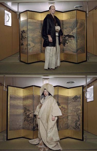
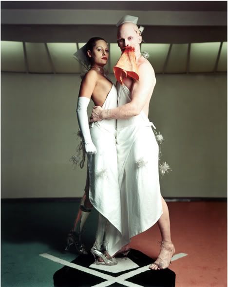
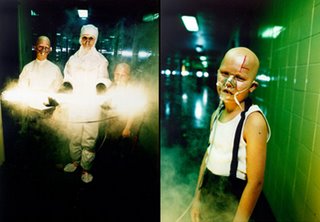
Matthew Barney

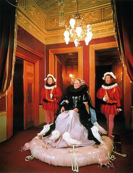
From the "Cremaster" Cycle.

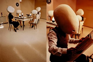
From "Drawing Restraint 9".

From the "Cremaster" Cycle.

Matthew Barney has a new film coming out, "Drawing Restraint 9", and while the style appears to be inimitably his, it also seems to be operating on a grander and simultaneously less contrived scale - it has something to do with Shinto, Japanese whalers, and a lot of blood, water and petroleum. I've always had a very ambivalent reaction towards Barney - I find his visuals remarkable and inspiring beyond words, but at the same time, sitting through the entire 400-minute run of the "Cremaster" cycle is simply interminable.

Which is why I'm excited about "Drawing Restraint 9". At 2-and-a-quarter hours in length, you won't end up falling asleep, and the collaborative influence of Barney's wife Björk (she composed the soundtrack and is prominently featured in the film) seems to have forced Barney out of his prior self-indulgence to some extent. While the "Cremaster" cycle was about digitally capturing performance art in motion, "Drawing Restraint 9" incorporates far more filmic techniques. If you're bound and determined to see at least part of the "Cremaster" cycle, take a look at the 30-minute excerpt "The Order", from "Cremaster 3" - it's currently the only part of the cycle available on DVD, and it gives a fairly good impression of the overall nature of the five films. Even more highly recommended, however, is the "Cremaster" book, currently available only in hardcover. It's a beautiful edition with a bevy of incredible photos and stills by Barney and Nancy Spector.

"Drawing Restraint 9" trailer (
youtube) (Quicktime)
"Cremaster" site (www.cremaster.net)


Saturday, June 24, 2006

kozyndan

"Metrohm-Peak Poster"

"Eureka"

"Uprisings"

kozyndan are a pair of artists out of L.A. who should be well-known to anyone who's ever read an issue of Giant Robot - "Uprisings", one of their most renowned pieces, was the cover of GR 28, and if there's a singular theme to their work, it would bean exploration of Asian pop culture. That and bunnies. And cute cartoon animals having sex.

I first discovered kozyndan's work while paying a visit to Blue C Sushi in the Fremont district of Seattle. They have at least two kozyndan prints on display there - "Uprisings", and "Portraits From The (Off) Center Of The Universe", a panoramic view of Fremont itself (as a side note, Blue C Sushi is probably the coolest sushi joint ever, and if you ever visit Seattle and don't take the opportunity to eat there, you've missed out.) They've also done cover art for two Postal Service EPs and a Japanese import-only Weezer EP, amongst other things.

Weird, wide-angle perspectives and an almost obscene attention to detail are kozyndan's forte. They're massively talented artists, but there's a slightly shaky, line-art quality to their work as well, which lends their paintings and sketches a moment-in-time, amateur-Polaroid quality. Most importantly, though, is that they obviously love what they do, and have immense fun just making art. Whenever I come across one of kozyndan's distinctive illustrations, I'm reminded of a quote by Neil Gaiman: "You mean I get to make stuff up and get paid for it too?"

kozyndan have a website and they also have a livejournal.

Wednesday, May 31, 2006

Nathan Jurevicius

"Album"

"Shift"

"9 Lives\Fuji Film"

Australian artist Nathan Jurevicius is cool beyond words. Despite the fact that his website is teensy, he is nevertheless a profound and blinding talent. Juxtapoz magazine has a nice little feature on him in their latest issue, and I heartily recommend picking up a copy. Jurevicius is also a noted toy designer, and though his junk is notoriously hard to find nowadays, arguably he works better in three dimensions than two (and that is saying something.)

Friday, May 26, 2006

Kris Lewis

Kris Lewis, "Promise Broken"

I admit it: I am a truly terrible blogger. In my defense, I offer the meagre excuse that although I believed school started two weeks ago, it in fact started THREE weeks ago, so my time has been spent madly catching up on all my courses - and unfortunately, in the process, neglecting the Cabinet.

To make up for it, today I give you the artwork of Kris Lewis. His work tends to feature elongated, willowy women with massive Margaret-Keane-ish eyes who are simultaneously beautiful and alien - although, if pressed to explain exactly what makes them seem so unnatural, I would mumble something incoherent about proportions and the law of thirds and finally admit that they aren't so much unreal as they are imbued with a quality only rarely seen in the natural world. In the words of the artist himself, "Artwork is love made visible", and it's obvious that he has a deep affection for the women he paints (not to mention, ironically enough, the truly odd-looking musical personalities he has captured.)

In regards to regular updates, I'd like to re-affirm that I'll update it 2-3 times a week - but you know what they say about wishes and fishes, and I'm simply under such enormous time constraints for the next month or so that posts will have to trickle through when I can find a few minutes to spare here and there. However! I'd like to extend the invitation to any literate-minded readers with an interest in pop art who might like to come on-board and fill in the gaps. Send me an email at quixote23 (at) gmail (dot) com if you're interested!
Wednesday, May 10, 2006

Miscellany

Kentucky Art*O*Mat Machine
designed by Laurie Russell

First up, a shout out to For Crumb's Sake, my esteemed roommate's blog. Tim blogs about indie music, hipster culture, local politics, and self-drawn comics starring anthropomorphic turtles. Tim claims that For Crumb's Sake is "1 & 1/8 more fun than a shovel museum," but I've been in shovel museums, and I think he's underestimating their ability to entertain and, might I add, to educate. I'd put the ratio at closer to 1.09:1, myself.

I don't know much about David Normal, but "The Bicycle Ride", his short animation paying tribute to the very first acid trip, is hilarious, disturbing, and about as close to an authentic bad trip as you're going to get short of renting "Faces of Death 8" and dropping a postage-stamp-sized tab of blotter.

Art*O*Mat is a clever public-installation\kitsch-art\commentary on our culture of instant gratification, comprised of a group of artists who obtain dozens of old cigarette machines, modify them to distribute small works of art rather than cancer sticks, and then re-distribute them in art galleries, public libraries, coffeeshops, and museums. You can check this list to see if there's an Art*O*Mat near you - sadly, the closest one to me is in Tacoma, and I NEVER go to Tacoma. But maybe I'll have to start, now.

Saturday, May 06, 2006

Jim Woodring


I apologise for the lack of updates over the last week or two, and I have no excuse other than the fact that I've been very busy and very disorganised. With luck (and maybe some concentrated application on my part) I'll be able to stick to my 2-3 posts-per-week schedule, because God knows, there's enough going on to justify it.

Pictured above are forthcoming figures from Press Pop, based of course on Jim Woodring's Frank, Pushpaw and Pupshaw from his long-running and wonderfully weird "Frank" comic. I first encountered Frank about ten years ago, when a girlfriend who was taking a course in Comics As Literature lent me her "textbooks". I remember spending hours sitting in a park on a warm May morning, endlessly fascinated by Woodring's wordless, Dali-meets-Felix-The-Cat illustrations. Even now, I can't help but be amused by Frank's constant hand-to-the-mouth shock as he encounters a parade of bizarre entities, whose occasionally bad-acid-trip appearances run perpendicular to their oftentimes friendly temperaments.

The figures above will be available in June, and while colour versions are currently available via the Press Pop website, I think I'll hold out for the monochromatic ones. After all, the comic is published in black and white, so why should the figures be anything other than that?

Monday, May 01, 2006

Cheap Paper Art

"Link"

"Not All Your Ideas Are Good"

"It's Okay, He's Canadian"

"Time To Do Something Stupid"

"Dying Is Awesome"

Over at Wonderland, Alice has posted a nice little review of the work of one Kelli Nelson, and, given the connection between her work and my last post on 8-bit art, I thought I'd pony up with my two cents. Kelli has a unique artistic style and a quirky sense of humour, which in my books is an unbeatable combination. She is also responsible for a number of self-published comics which are available for purchase via her website, and not a few mini-comics and weekly comics, all of which can be viewed and appreciated online for the low, low price of free.

Wednesday, April 26, 2006

I AM 8-BIT


Sean Clarity, Peter Gronquist, Gabe Swarr
(click image for full-sized version)

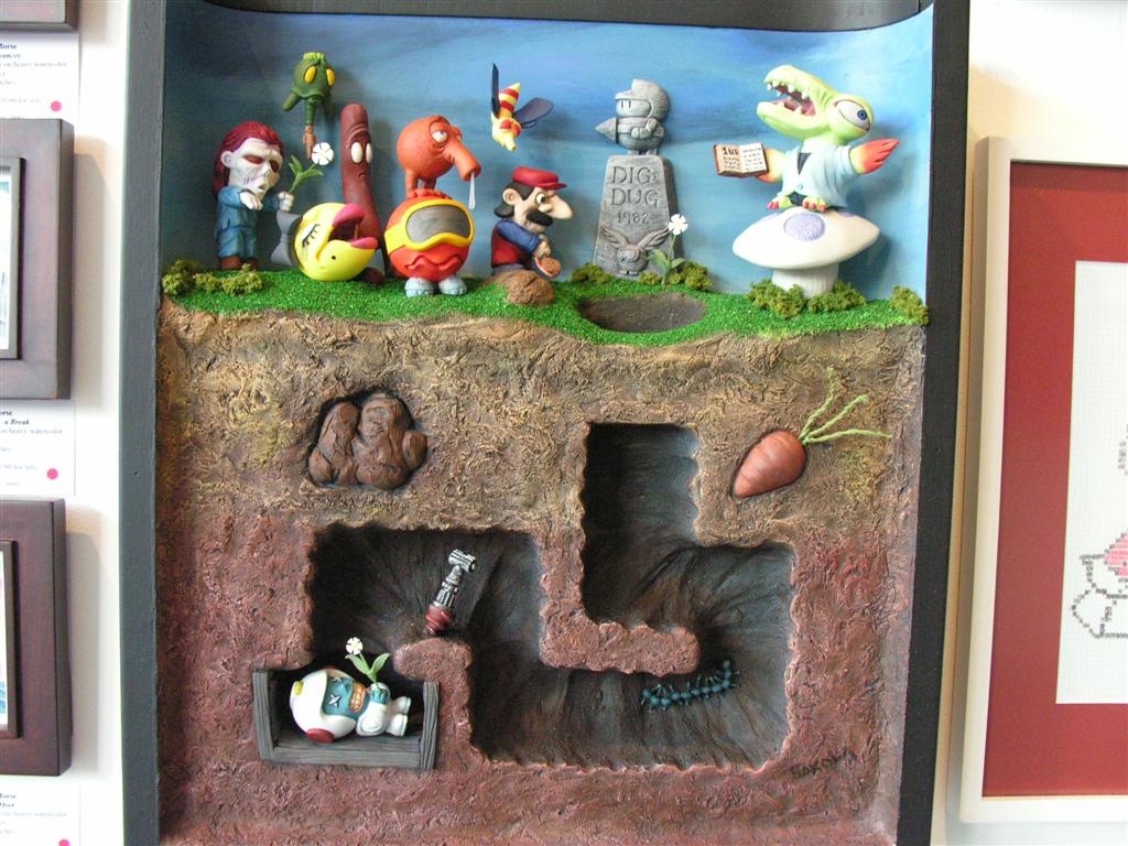
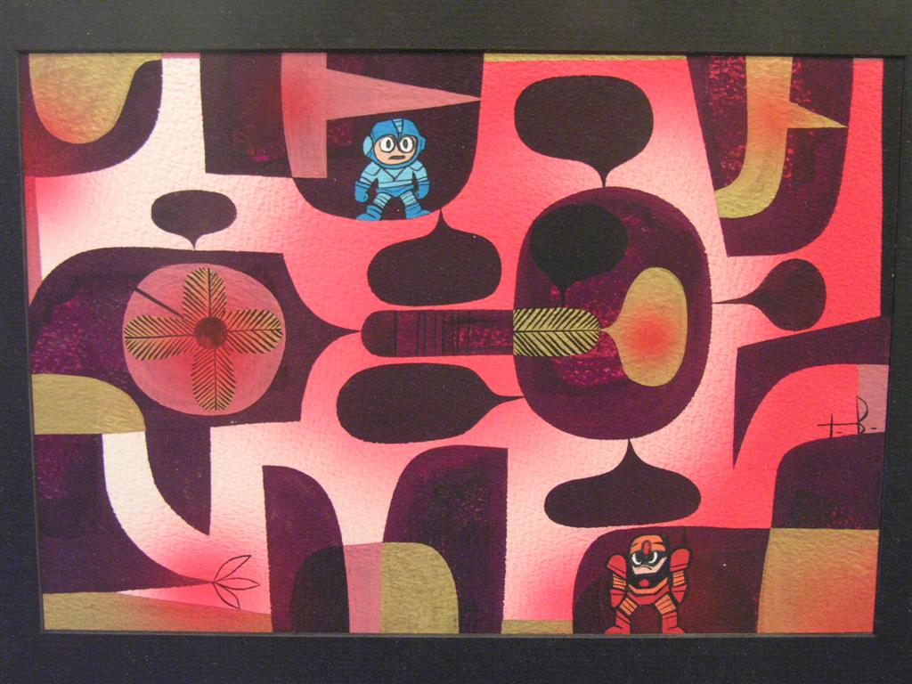
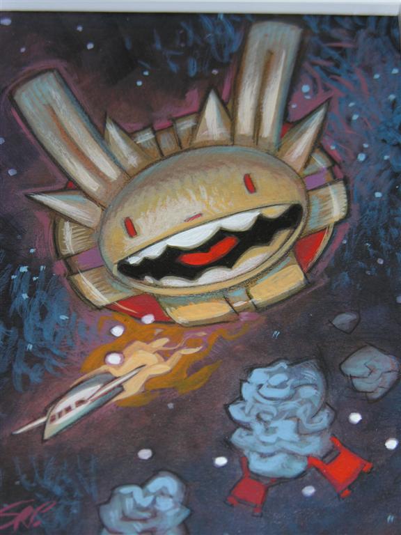
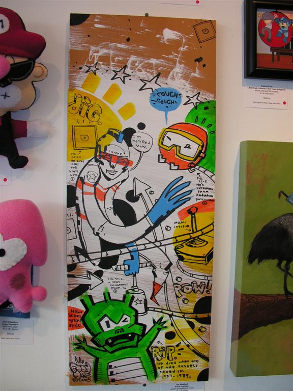
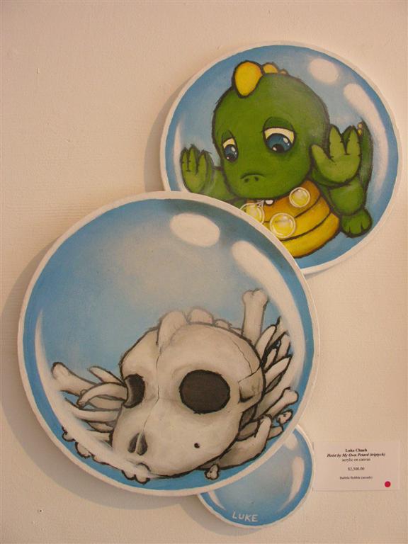
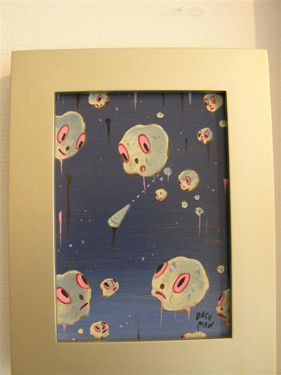
Another day, another reason to move to Los Angeles. Gallery Nineteen Eighty-Eight, located at 7020 Melrose Ave. in L.A., is hosting the second annual I AM 8-BIT exhibition, and... wow. The first series was pretty neat, but this new one is amazing. So much videogame love.


Michael Gagne, Martin Ontiveros
(click image for full-sized version)

The list of contributors is a veritable who's-who of the contemporary pop surrealism scene: Tim Biskup, Steve Purcell, Jim Mahfood, Luke Chueh, Gary Baseman, Brandon Bird, and dozens more. Who knew that Nintendo was so universal and profoundly influential? Most works draw their inspiration either from the NES roster (Super Mario Bros, Megaman, Metroid) or from the earlier Atari era (Pacman, Asteroids, Donkey Kong,) with few if any references beyond the late '80s. A handful even comment on the nature of videogaming itself.


Jose Emroca Flores, Love Ablan, Yosuke Ueno
(click image for full-sized version)

If you live in or near L.A., you could do worse than to plan a visit to Nineteen Eighty-Eight this weekend. If you don't, you're still in luck. The first I AM 8-BIT collection has been collected and recently published by Chronicle Books, and is readily available at Amazon.com. At under $15 USD, the book is stupidly affordable and you really owe it to yourself to add it to your own library.

Link: I AM 8-BIT website.
Link: Gallery Nineteen Eighty-Eight.
Link: I AM 8-BIT: Art Inspired by Classic Videogames of the '80s at Amazon.

(note: All above photos were originally posted at Vinyl Pulse, an art blog which I heartily endorse and recommend. I cropped them and did some other minor tweaks for presentation's sake but all credit goes to Vinyl Pulse and the original photographer.)

Friday, April 21, 2006

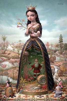
Mark Ryden

The Creatrix

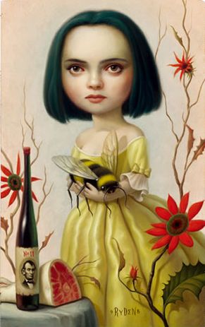
Chances are this will be merely the first of many entries about Mark Ryden - along with Camille Rose Garcia and Tim Biskup, Ryden was one of the first artists to introduce me to pop surrealist art, and there's something about his style - the attention to detail, maybe, or perhaps the fact that his figures tend to resemble a cross between dolls and Christina Ricci - that I find endlessly appealing. I could spend (and in fact have spent) hours staring at his artwork.

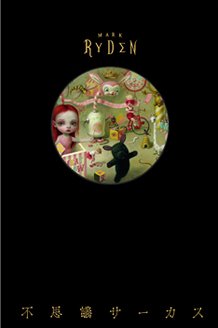
Ryden's recent hardcover book "Fushigi Circus" (aka "Mysterious Circus") is up for sale at Last Gasp (incidentally, an excellent, reliable and highly professional source for all your art book and print needs) for the insanely low price of $35.00 USD, so I recommend you take advantage of this and order your copy while supplies last. Even in the highly unlikely case that you've never heard of Mark Ryden, you won't be disappointed.

"Fushigi Circus" Cover

Thursday, April 20, 2006

Sarina J. Brewer and the Minnesota Association of Rogue Taxidermy

Frankensquirrel

Mummified Chupacabra

Winged Cat

I have a confession to make: I have a huge schoolboy crush on Sarina J. Brewer, the talented (and immensely hot) artist currently staging a one-woman taxidermy-as-art revival. Okay, so that part isn't strictly true... But she is the co-founder of the Minnesota Association of Rogue Taxidermy, a cadre of individuals dedicated to advocating "the showmanship of oddities, espousing the belief in natural adaptation and mutation, and encouraging the desire to create displays of curiosity," a cause which I obviously consider more than worthy.

Brewer's works fall into a number of categories: traditional pieces; novelties; "gaffs" (or fantastic creatures); carcass sculpture (it's about as grisly as it sounds); preserved specimens, and so forth. I myself am particularly partial to the Griffin and the surprisingly angelic and lovely Capricorn... and of course, who doesn't love a little Jackalope? And then there are the functional pieces, like the Squirrel Decanter and Squirrel Lamp. I dream of a day when every item in my apartment is made from the corpse of an animal, and I owe that dream to Sarina J. Brewer.

(M.A.R.T. co-founder Robert Marbury's Urban Beast Project is worth checking out as well; his animals seem to fall somewhere between adorably fluffy pets and creepy plush toys come to life. You gotta respect any taxidermist who takes a cue from Jorge Luis Borges.)

Sunday, April 16, 2006

Winsor McCay

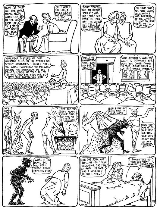
Dreams of a Rarebit Fiend
(Click image for full-size)

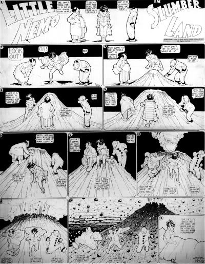
Winsor McCay is best known as the creator of the turn of the century strip "Little Nemo in Slumberland", in which a young boy has surreal nightly adventures in the land of dreams. What he is less known for is his concurrent strip "Dreams of a Rarebit Fiend" ("Nemo" ran from 1905 to 1914, while "Rarebit Fiend" ran from 1904 to 1913.) While "Nemo" was, for all its disturbing and occasionally violent imagery, ostensibly a children's strip, "Rarebit Fiend" was firmly directed towards adults, and seems bizarre and edgy even in comparison to today's bland, content-regulated funny-pages fare.

Each "Rarebit Fiend" strip is highly formulaic. A semi-realistic situation is set up, which escalates over the course of seven or eight panels into pure surrealistic chaos - until the punchline of the last panel, which is always the same: the protagonist of the strip wakes up in bed, looking stunned and sheepish, swearing off "welsh rarebit" (or simply toasted cheese) before bed for good. Within this formula, however, McCay (who was forced to use the pseudonym "Silas" by the editor of the Herald, wherein his massively successful "Nemo" strip appeared and his real name was practically a brand name in and of itself) was given free reign to be as strange and imaginative as he wished, and "Dreams of a Rarebit Fiend" is full of Masonic rituals (see above), people growing antlers, fat jockeys crushing their horses, dead stoles coming back to life, and so forth.

"Little Nemo" was, without question, one of the first truly important newspaper cartoons (the first being "The Yellow Kid", published in the late 19th C. ) and it continues to have a phenomenal impact even today, on everyone from Matt Groening to Neil Gaiman - McCay set the stage for cartoonists to develop their own unique styles of illustration and storytelling, and the strip was of a consistently high quality from beginning to end. "Rarebit", on the other hand, tends to be a bit more uneven; it possesses a decidedly sketchy and compulsive quality, as if McCay were throwing each strip together in the middle of the night, inspired by his actual dreams.

Currently, there is no comprehensive collection of McCay's "Dreams of a Rarebit Fiend", but Dover has recently reprinted their 60-page trade paperback, which is worth picking up from from Amazon or your local retailer for the price alone. Dover has also re-released their "Little Nemo" collection, but it too is unfortunately incomplete. The best and highest-quality "Little Nemo" collection is the out-of-print "So Many Splendid Sundays", but until Sunday Press decides to release a 3rd edition, we'll have to content ourselves with the Dover collection and the McCay retrospective "Daydreams & Nightmares" (which is an excellent book in its own right, I should point out.)

Little Nemo in Slumberland
(Click image for full-size)

Thursday, April 13, 2006

Parastone - Mouseion Collection

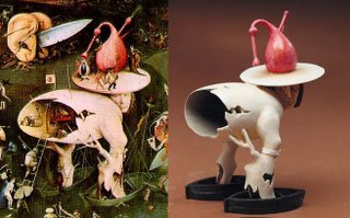
(left: Original Bosch detail; right: Parastone sculpt.)

Dutch design house Parastone create what amount to action figures (although I'm sure they would prefer the term "sculpture" or "miniatures") based around famous works of art. While it's hardly notable to base a miniature around Rodin's "The Thinker" or Dürer's "Hände eines Apostel", you gotta throw it up for anyone who successfully attempts a three-dimensional undertaking of M.C. Escher's illustrations. My favorites, of course, are the Bosch miniatures -- that's class right there.

All of these figurines are available for purchase, but I'll be damned if I can figure out exactly how to order them. If you manage to do so, let me know - my life is severely lacking in Salvador Dalí
miniatures. And you know yours is too.


Wednesday, April 12, 2006

Kropserkel Designs

A quick update for you today, since I'm right in the middle of exam week: a couple of steampunk-inspired rayguns, and Captain Nemo's "light blade", from Kropserkel Designs (makers of the renowned severed horse-head pillow.) Besides their incredibly detailed replica work, Kropserkel have done some really beautiful original designs, including their "Robots"-looking mechanical men and my personal favorite, the Peter Pan series.

Link to Kropserkel Designs website.

(All images © 2006 Kropserkel Inc.)

Sunday, April 09, 2006

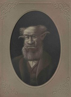
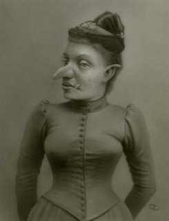
Travis A. Louie

Archibald Langston circa. 1897

Big Bill Gruff circa. 1887

Miss Sophie Grizzletooth

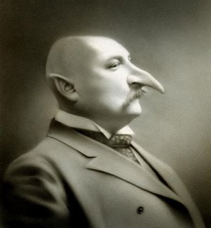
In keeping with this week's whole "Unnatural Creatures Posing For Formal Victorian-Era Portraits" theme, I give you Travis Louie's series of 19th C. goblins, trolls and ogres in upper-class formal wear. Louie has an upcoming show in May 2006 at the Roq La Rue gallery (if you've never been, drop whatever you're doing and book a flight to Seattle now!) alongside the equally-brilliant Robert Craig.

Travis Louie is another artist who works in the whole "chimaera" vein of half-human, half-animal portraiture, and goes even further than that into the realm of fantastic, imaginary beasts and beings incongruously placed in conventional everyday settings. His website is chock-full of ghoulish delights - go take a look.

Link to Travis A. Louie's website at Artroof.

(All images © Travis A. Louie 2006)

Saturday, April 08, 2006

Brandon Bird

King of the Cage

Those That Bind

Cash Comics

If his artwork is any indication, Brandon Bird resides in an alternate universe vastly superior to our own, where Bea Arthur wrestles velociraptors, Star Trek Captains are the subject of Renaissance spectacles, and Johnny Cash is a comic book superhero. Bird is like a pop-cultural reference clearinghouse. His website is a better introduction to his work than I could ever be, so if you have even a shred of love for Christopher Walken, Chuck Norris or Jabba The Hutt, you owe yourself a visit.

Link to Brandon Bird's website.

(All images © Brandon Bird 2006)

Floria Sigismondi


I can't praise Floria Sigismondi enough. Her music videos for Marilyn Manson, Sigur Ros and David Bowie are haunting and beautiful, and her photography is even more stunning. Her second collection, Immune, published by Gestalten Verlag, was released this past November and it is from this volume that the above photographs were taken (the first volume, also published by Gestalten Verlag, was titled Redemption and is currently both out of print and in great demand - copies sell at auction anywhere from $60 USD to $600 USD.) Both books are incredible and worth every penny.

Studio execs of the world: give Floria Sigismondi lots and lots of money to make feature films. Palm Pictures: for your next series of Director's Label DVDs, I urge to you consider Floria Sigismondi for inclusion. Everyone else: visit Floria's website, and order a copy of Immune before it, too, goes out of print.

Link to Floria Sigismondi's website.

(All Images © Floria Sigismondi 2006)

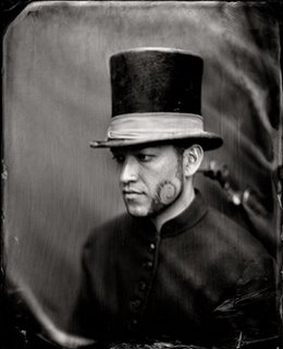
Zohar Studios

Study For A Painting

From Memory (Series)

The Raven

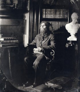
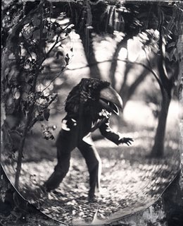
Stephen Berkman is the massively talented photographer and artist behind Zohar Studios (motto: "The New Instantaneous Process Employed".) He utilises a photographic technique called ambrotype which involves a silver nitrate development of a glass negative which appears positive when placed against a white backing. Ambrotype is similar to daguerrotype but less expensive, and experienced a short-lived popularity in the mid-19th century. I've always found this sort of antiquated look very appealing and Berkman's subject matter is perfectly suited to the technique.

Both the "From Memory" series and "The Raven" bring to mind Moreau's human-animal chimaera from H.G. Wells' "The Island of Dr. Moreau". "Study For A Painting" reminds me of the sort of awkward, ethnocentric posed portraits that were so popular during the heyday of the British Empire, wherein "noble savages" would be dressed up in stiff, European attire and photographed. All of Berkman's work is infused with a grim grotesque quality that I find fascinating. Take a look at his website.

Link to Stephen Berkman's Zohar Studios.

(All images © Stephen Berkman 2006)